I was preparing another image for one of my series and for this purpose I was taking several pictures to choose from among those the ones I would need for it. However, as it often happens, at some point I took another path and I created something different from what I was planning. I like minimal images, but I honestly have little ability for them. The partner in crime says mine is horror vacui, and probably he is right. Anyway, this wasn’t conceived as a minimal picture, but it became one.
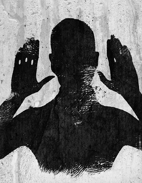
The following is the fourth image in a series titled “Altered States”, which is something I am working on right now. The series is a cheeky challenge to the absurd perception we have of the dualism that sees altered consciousness and mental disorder opposed to the reassuring accepted set of notions we identify with normality. This image in the specific started as an easy project, but for a while it made me go bonkers.
You can’t win them all, as the saying goes. I had a rough sketch in mind for the image, but I didn’t have the time to complete it for a whole week. I only had the time to snap a couple of rushed shots at first, but on closer inspection they were unusable. The light was all wrong, with blown highlights and boring illumination overall. I spent hours on a forgettable combo of pictures attempting to save it in post without much success.
After struggling for a few days with the first version of the image, I finally recognized there wasn’t much I could do to make it look “right”. The amount of processing I had applied ruined in part the feel I wanted for the image on the whole. In spite of the ridiculous amount of processing applied, the quality of the light was still noticeably horrible. Even with the most sophisticated software you can’t fix boring lighting. The first version was simply a poor rendition of my original idea and I had to discard it. Continue reading “How I Did It – iPhoneography Process Study #2 – Ego Death”
I called the following iPhone image “The Message”. It’s a montage of several separate elements, processed multiple times and assembled together. Some simple sketching was done for it as well. I realized only after completing it, that in this piece I expressed some of my admiration for Odilon Redon‘s works. However, the surreal photo montage has a cheeky modern twist to it and Redon would probably find it too mundane… Even though Redon’s illustrations are certainly some of the finest examples of symbolist art so I am not really suggesting we can compare the two, I think I managed to infuse some “mystery” and personal idiosyncrasy into it. I won’t go into subject matter explanations, so I hope you get a “feeling” for it without useless dissertations.
Even though the partner in crime is not happy with having cameras pointed at him, he kindly let me take a photo of him in a totally tiny, narrow, deserted dead-end alley, where a bench was curiously placed on the dead end’s side (you gotta love Lisbon’s absurd urban configuration). Even though nobody was in sight and as far as I know the place could have been abandoned for years, going in to take a photo felt very much like intruding. I wanted to use the image badly, but I promised the model not to make it an environmental portrait of some sort… I had to change the original image more than just a little for achieving this.
I don’t know why I’m being so sci-fi oriented lately. We had another article with space influences just a few weeks ago. This time I intend to be pragmatic, so I am turning my space idyll into a tutorial. Perhaps you were going to have ice-cream and you don’t want to waste your time on it. After all, who cares about Stanislaw Lem? He’s dead. And if he weren’t, he wouldn’t be happy about his involvement in this at all. But even if you have never read anything by Lem, you could still find this tutorial useful, so read on.
Some days you are applying yourself to a specific project and everything you come up with looks invariably wrong. It’s not that your image will look bad per se, but the feeling is things are just not what you are after, and you cannot understand when and how you took a wrong turn. It’s like with trying to fix a spoiled recipe (cookery is another serious business and an art in its own right): if the dough is not rising and you cannot figure out why, it’s time to take a break and focus on something else. Gardening or knitting perhaps—good luck with these two.
I’ve read many times complaints coming from iPhone users who wished they could disable Hipstamatic frames like they do with a number of other apps. There are also users complaining about the opposite, that is not being able to apply Hipstamatic’s effects to photos from albums and camera roll. Hipstamatic’s purists will argue that the point of the app is to reproduce the practices connected with analog photo taking, so it’s obvious you should accept a certain lack of control on the result as an added extra and use the app to shoot if you want to apply its effects to your photos. In the end, what really matters is your image; if using a certain border brings your photo closer to your way of envisioning it, you can just ignore purisms.
Robusta frame applied to photo taken with Vscocam and processed over with Laminar, Alien Sky, Mextures.
Today I will share a simple trick for using Hipstamatic’s frames outside the app. This is a cheap trick, really. The result relies on layer blending and it just requires five minutes to achieve, plus access to Hipstamatic (duh) and an image editing app such as Photoshop Touch or Laminar. Continue reading “iPhoneography Tricks: Using Hipstamatic Frames with Album Photos”
This is a new installment in our iPhoto Tips series for beginners and intermediate photography apps users. The aim is to help iPhone shooters to enhance mobile pictures and create original artwork with them. The techniques shown are very easy to reproduce and can be adapted to a variety of styles with just a little creativity.
In this tutorial we’ll be using multiple layers’ blending to create a new image from a simple — and boring! — iPhone shot.
I am starting with this rose picture, taken with the iPhone 4s default Camera app:
It’s true, most travelers these days will go nowhere without a camera. Many of them choose their camera phone as their primary camera because it’s easier to bring with them at all times. One condition that travelers usually consider when picking their next destination, consciously or unconsciously, is that it promises to be a photogenically rewarding subject. A photo is evidence you have somehow “made yours” what you saw, thus a photo you take is a strong assessment of places you visit. If photography is such an important affair, better be sure it’s going to be worth it.
Here are some tips that can help you to take better photos during your next trip—they will work with most destinations, really. Note that this is not intended as a technical travel photography guide: it’s just common sense, something we all need when we travel, but we often forget, that is. Continue reading “Easy Tips to Camera Phone Travel Photos You Will Like”
Making use of layer blending can take your iPhone and iPad photography and your post-processing on a higher level, as it enormously widens creative possibilities. However, working with blending modes can be confusing at first and differences between one mode and the next can appear not completely evident.
As a matter of fact, no photo app comes with a truly informative guide to help the newbie in the task of getting started with layer blending. The best idea is to experiment how each mode affects your images, but it can be tough to get the hang of it. For this reason, I am writing a brief overview of the most used blending modes in iPhone photo apps. Most of them you can also find in photo editing programs as Photoshop, some others have slightly different names — but what you can achieve with them is exactly the same. Hopefully, this little guide will help you have a better understanding of what each of the commonest layer blending modes used in today’s photo applications can do.
First, let me explain a few crucial terms used in the layer blending modes descriptions: a Base Layer is the original image you start with; a Blend Layer is the layer placed above the base that needs to be blended with it. To make things easier to understand, I will be grouping modes according to the result they allow to achieve, rather than according to their strictly technical definitions.
These are two random iPhone sample images I am going to use in the guide.
A slightly washed out look with vibrant colors is very easy to create using one or more of the many apps which are provided to iPhone and iPad users. There are tons of presets around to obtain similar results, but in some instances, the best option you have to make sure effects will go well with your photos is creating your own, fine-tuning every setting to make sure the result will be as you like.
For this brief tutorial I am using PhotoForge 2 on the iPhone, as it has everything I need for my purpose. You can follow exactly the same steps on the iPad.
1. Open your photo of choice in PhotoForge 2. I am using a random photo I have taken a few days ago while testing the macro lens for iPhone.
Step 1 - Choosing the photo
2. Go to Adjustments by tapping on the three-slider icon and select Brightness/Contrast. Move the brightness slider control up to around +5; do the opposite with contrast and move it down to about -50. Depending on the overall brightness and contrast of the original photo, you may want to adjust these values for obtaining the right degree of fading on the image of your choice.
Step 2 - Fading the photo
3. Now let’s produce some color shifting. Remaining in Adjustments, Select Curves. Set the curves in RGB mode for each of the three colors, Red, Green and Blue. Try to achieve something close to what is shown in the screenshots.
Step 2 - Adjusting colors
4. For this style, we want a faded overall look, but at the same time we are looking for vivid colors. Always in Adjustments, select Vibrance. Move the slider up to +25.
Step 3 - Toning up color
As a final touch, we are going to add some vignetting. In PhotoForge 2, you can add a vignette simply using the Vignette tool included in the app’s FX section. However, I prefer the vignette to blend a little more with the photo, so I am using Layers to achieve a slightly better result.
5. Go to Layers by tapping on the three-layer icon and create a new blank layer above the photo’s; select a white fill color for it. Change the layer’s blending mode to Multiply. Leave opacity to 1.
Step 5/1 - Creating a new white layerStep 5/2 - Changing the layer mode to multiply
6. Go to FX and select Vignette. Pick a vignette style that goes well with your photo. In my case, I choose Vignette 2 and I move the intensity control up to around 0.60. For a more “enclosed” feeling, you can raise intensity even more.
Step 6 - Adding vignette
And that’s it! You can save the photo to your photo album or share it with whomever you like. PhotoForge2 saves the complete history of your post-processing, so you can go back in any moment and if you do not like the final look of your image you can make further adjustments to contrast, curves, vibrance, and so on. Step 7 - Final result